The National Portrait Gallery in London has always felt like the poor cousin of the National Gallery, an afterthought tucked around the back of the star attraction. It stands as an awkward rear extension, squeezed into an unloved armpit where the sticky chaos of Leicester Square spills into Charing Cross Road, while visitors have always been shuffled through an apologetic side entrance, as if being invited in to collect the bins.
The reason it is so unwelcoming is that when the gallery was built in 1896 after its first years in temporary premises, it faced directly on to a slum – “a neighbourhood of crime and vice”, as architectural historian Nikolaus Pevsner put it – and the insalubrious streets of Soho beyond. This regal repository of painted noblemen couldn’t be seen to be fronting on to such a seedy district, so the architect, Ewan Christian, moved the entrance as far around the corner as he could, to face the more seemly setting of St Martin-in-the-Fields church. As a result, the building’s front has always looked like its back, the palazzo-like facade of arched windows and roundels crucially missing a front door.
Almost 130 years later, three momentous bronze portals have burst through the Grade I-listed stone walls, as part of the most radical transformation in the institution’s history. In the hands of Jamie Fobert Architects and heritage specialists Purcell, new galleries have been opened up, learning spaces and restaurants added, and a public forecourt created, in a £41.3m process of surgical slicing and stitching, giving the rambling warren a vital new lease of life.
“It’s the great building Londoners never knew they had,” says Fobert, standing outside the gallery’s new entrance. “Our job was to open it up, tie its different eras together, and give it a new public face.” As his work at Tate St Ives and Kettle’s Yard attests, he is well positioned to accomplish such a task, free of the usual architect’s urge to stamp his own signature too boldly.
Where once there was a triangular scrap of fenced-off grass on the street corner, now stretches an inviting public space, providing a moment of pause between the bustle of Trafalgar and Leicester Squares. A chunky granite bench (mercifully free of anti-skating studs and anti-homeless bars) sweeps around an existing statue, echoing the curve of the road and merging into a broad set of stairs, while the pavement slopes up behind, bringing level access to the front door in a way that doesn’t feel like a separate “accessible” ramp. On a recent visit, one wheelchair user asked where the ramp was – only to find they had already glided up it, unawares. It’s a simple move, but one that is worlds away from the former indignity of being sent down a side alley to a separate ramped service entrance.
“The idea was to make the experience the same for everyone,” says Fobert, “and intervene in ways that are almost imperceptible.” You probably won’t realise that a hefty concrete platform was craned in to bridge over a sunken lightwell to the new entrance, as the granite paving flows across it seamlessly. More noticeable are the sharply sliced openings, where the architects have taken their scalpel to the base of three windows and slashed through the Portland stone plinth to expose the fresh interior of the rock, in striking contrast to its gnarled outer surface. It leaves the Victorian mouldings playfully truncated, echoing the staccato postmodern facade of Venturi Scott Brown’s National Gallery Sainsbury Wing next door (currently undergoing its own less sensitive remodelling.

The new four-metre high bronze doors have provided a happy opportunity to address the gallery’s historic gender imbalance. Forty-five faces of women, scribbled by Tracey Emin, now beam out from the bronze panelling, as a foil to the row of 14 white male painters who look down, stony-faced, from the Victorian roundels above. It’s a hint of what awaits: the rehang features 48% women in the 20th and 21st-century galleries, compared with the previous 35%.
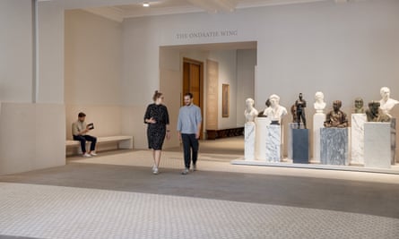
Inside, a sense of light, space and legibility has been flushed throughout the building, as if it’s undergone a supercharged spring clean, banishing much of the former gloom. “The building had never had a holistic review,” says Purcell’s Liz Smith. “This was an opportunity to tidy everything up and make it more coherent.” The entrance lobby is twice the size of the original, floored with a stunning marble and terrazzo carpet (inspired by Carlo Scarpa’s patterns), Fobert’s equivalent of Christian’s intricate mosaic flooring, which has been meticulously restored by Purcell. A huddle of busts, hauled out of storage, stand assembled on a forest of marble plinths, while blocked-up windows have been opened, bringing daylight and views into the lobby and a new shop (reduced in size by a third, bucking the retail-thirsty trend).

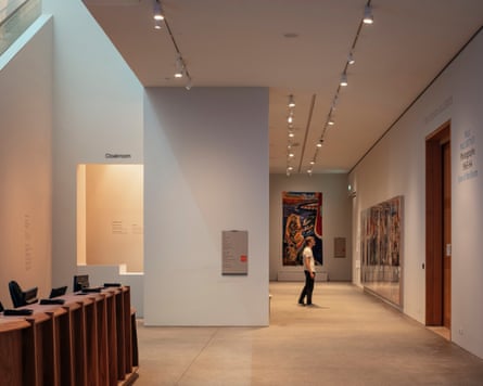
While the previous route to the galleries entailed traipsing through revolving glass doors, up some steps, past a ticket desk and up a three-storey escalator before you got anywhere near the free collection, now there is art on view as soon as you arrive. A gallery of recent acquisitions extends to one side of a ribbed walnut ticket desk, while a wall screens the glass escalator of a 2000s remodelling, helping to reduce the shopping mall vibes, and creating the surreal spectacle of disembodied heads drifting upstairs.
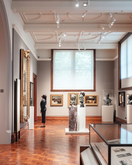
The historic galleries feel invigorated and are now much easier to navigate. New openings restore the cruciform layout and fully connect the Victorian rooms to the Ondaatje Wing (added by Dixon Jones in 2000) for the first time. Larger than life monarchs hang at the end of long visual axes, staring each other down. Interpretation designers, Nissen Richards Studio, have brought a smart clarity to proceedings, updating the tired feel of the 1990s displays, while the grey-walled galleries upstairs have been lined with a rich rainbow of deeply dyed wool, each room a different hue, helping visitors find their way among the halls of Tudors and their murdered wives.
Much of the previously fusty, dusty feeling has been brightened up by, quite literally, letting in the light. After extensive digital modelling by environmental wizards Max Fordham, blocked windows have been ripped open, bringing in bursts of daylight that help to prevent gallery fatigue (made possible by sophisticated UV film on the glass), while cumbersome lighting grids have been slimmed down. The engineers also applied their skill with ducts and pipes to a new suite of galleries – spaces that had been converted into offices, but can now be returned to their original use thanks to an air handling system, deftly inserted within the thickness of the walls. Purcell have replicated mouldings, doors and windows, meanwhile, making the difference between new and old imperceptible.
It is a finely judged balance of faithful restoration and judicious intervention, with contemporary touches from Fobert, such as the sinuous two-sided gallery benches and elegant walnut display cases, adding an extra layer to the historical collage. His motif of chamfered corners – sampled from Christian’s “beak chamfered” columns and pilasters – appears throughout, on walls, display cases and furniture, and subtly helps to tie the different epochs together.

Back downstairs, the former main entrance is now dedicated to school groups, which will enjoy three times more learning space than before, in what used to be a lower-ground storage area. It is reached by a sculptural concrete staircase, with a bronze balustrade motif that echoes the curve of the street outside, giving a sense of grandeur to a function that can often feel like an afterthought. The architects have cleverly removed a mezzanine from the building’s original double-height kitchen to carve out lofty classrooms that open on to a sunken courtyard, planted with a pair of mature acer trees, while the area below the entrance bridge has been walled in with glass, creating an additional education pavilion and bringing more daylight. Astonishingly, this 70 square-metre room is the only “new” space in the entire project – the architects managed to “find” the other 950 square metres elsewhere in the building, as if playing Cash in the Attic on a grand scale.
One such archaeological discovery was made in the east wing, where a previously off-limits rotunda has been revealed as part of a new bar, featuring mosaic that was buried under a suspended floor. The only bum note is that the museum’s new dining establishments have been fitted out by the caterer’s in-house design team, so the result is a gaudy eyeful of velvet and brass, reminiscent of a kitsch Soho boudoir. Fobert winces as we watch gold leaf being applied to the wall in abstract painterly streaks, worthy of Laurence Llewelyn-Bowen. “This is nothing to do with us,” he notes, before moving swiftly on. “You can’t win every battle.”

